Drawing the Great Conjunction - A study in Bad Sci Viz
December 22, 2020
What gets me in a tizzy? Seeing bad scientific visualizations (sciviz). And by bad I don’t mean just aesthetically challenged, but rather bad in the sense of distorting or ignoring the science the illustration is supposed to explain or communicate. The Great Conjunction 2020 has provided a bounty of bad Science Visualization - and for no real good reason that I can see either. Let’s start with a mug shot.
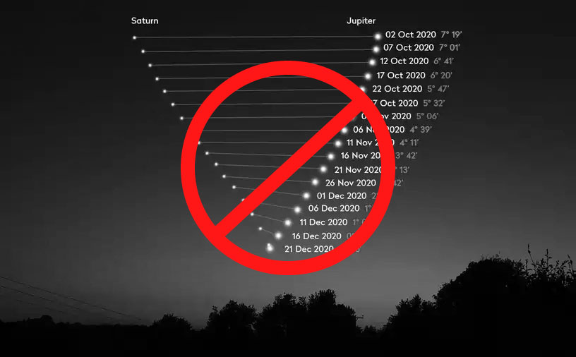
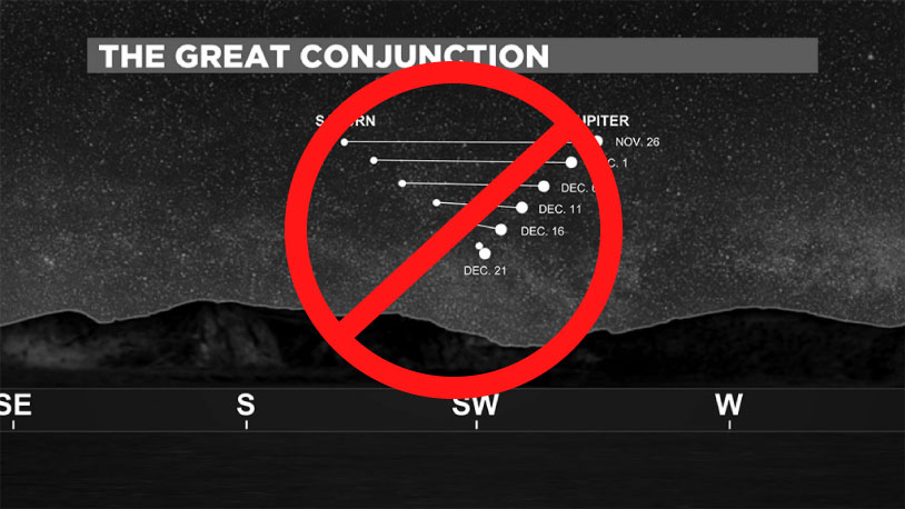
The “flying V” as I call it, was the first to start making the rounds. It popped up on social sites a few weeks ago, and yes, it did grab my attention because it was compelling and seemed to explain the science - two things any good sci-viz should strive for. When people shared this image, they often added a little line like “The best explanation I’ve seen…” or something to that effect. That’s when I starting thinking - does the image explain anything? What’s going on up there in the sky that needs explaining?
I should mention also, that in the context of astrophotography and visualizations, if the designer puts a horizon on the bottom of the image, and dates next to celestial bodies, the default assumption is that the visualization is supposed to be a representation of what one would see, looking up in the sky, on those dates. I don’t think there’s any arguing with that. So, does Offender 1 do that? Is that how the planets would look like as the weeks marched from October to December?
Basic Physics of the Great Conjunction
To answer that, let’s take a quick detour into some basic celestial mechanics. Below we see two views of a simplified solar system. There are 3 bodies orbiting a central ‘sun’. On the left, is the top-down view. On the right, the side view of the system. Click play to watch the system in motion. Notice how from the side, all the planets appear to move back and forth around the central point.
(Note: this, and the following simulation are gross simplifications of solar systems, but they are useful for seeing the essential concepts here.)
But, we never get to see either of the views in real life. So, let’s make a version that shows what a viewer on the inner most planet would see in the sky.
This time, we have the same view on the left, from an imaginary place above the whole solar system. On right, we have a simplified view from the ground of the white, innermost orbiter. Click play to see the system in motion. Notice how when the two objects in the sky overlap, all three objects on the left are in a line. (Use the slider to find those moments) That’s CONJUNCTION.
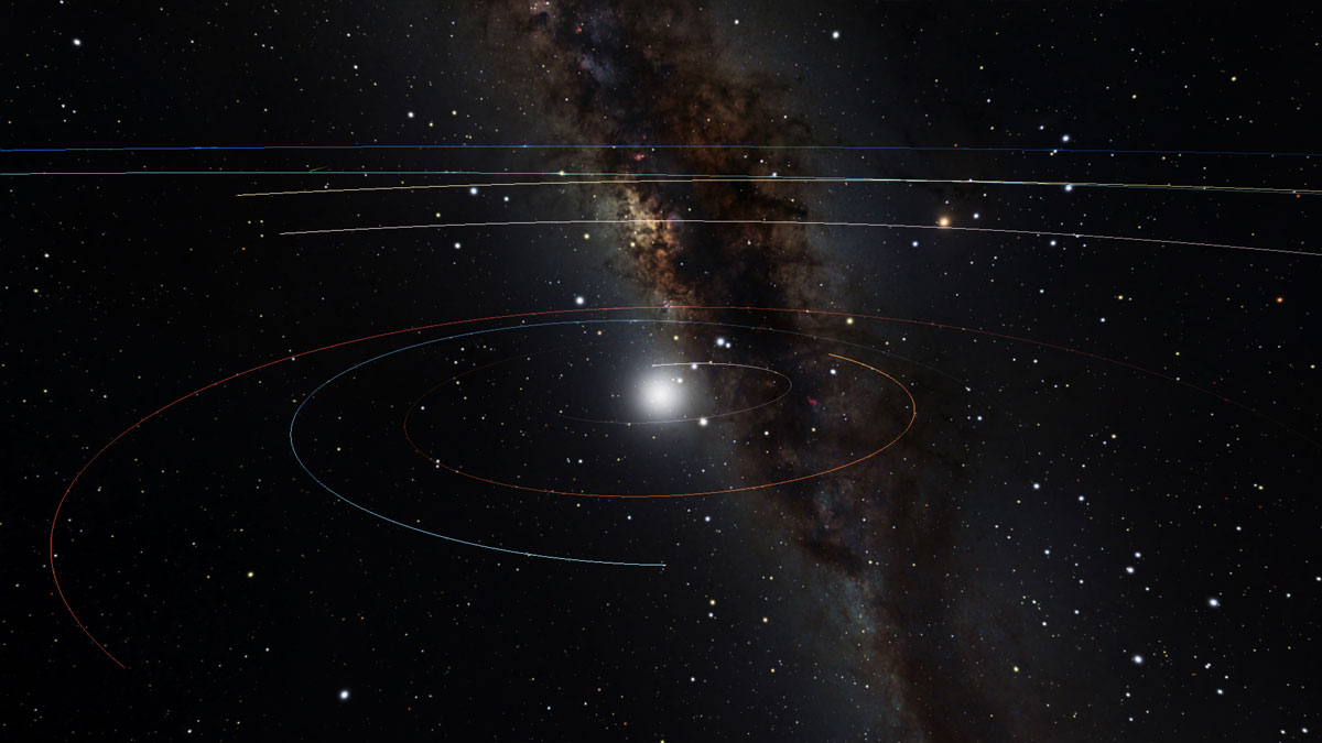
Our goal is presenting this astronomical event in one still image - an image that is both compelling and rooted in the science. This is always the dance any sci-viz product must perform. Our sims above are much too simple to make a full model of what is really transpiring in the skies above. After all, the orbits of the planets are not perfect circles (they are ellipses) and they are not all in the same plane.
Just to give a taste of the complexities, here’s our simple solar system model, with ellipses and inclinations. The three orbits are slightly tilted with respect to each other, and they are ellipses, not circles. We could add more and more details to the model, but that will take us too far astray.
The take away here is that even though the orbits are slightly tilted and elliptical, all the planets in the sky (and the sun) stay within the bounds of a very narrow slice of the sky called the ecliptic. Here, shown in the blue:
And so, the notion that the bad sci viz image above tends to convey, is that the planets are crossing in big X’s in the sky. This would mean there is no ecliptic. In another few years, the planets would be traveling around the solar system like the lines on a basketball. That’s the first (of several) major inaccuracies.
They are not crossing each other in a intersection, but rather *chasing* each other along the ecliptic. The closer ones (Jupiter in the case of the Great Conjunction) move faster in the sky and are always in the process of catching up to the outer planets (from our prespective).
Let’s get Serious
So, we’ll use more powerful tools going forward to simulate the night sky and the positions of all of these heavenly bodies. Let’s bring out the big guns. We’ll use OpenSpace to do full featured simulations of the night sky. The planetary positions are all calculated using NASA/JPL spice kernals that are about as good as it gets in terms of accuracy.
I won’t get into the details of setting up the OpenSpace simulation here (there’s help out there if you want to do that!) but instead just go straight to the results. The following animations shows the two planets in daily snapshots over NYC as time moves on. They are daily snapshots taken at the same time of day. Since the earth is turning, their positions above the horizon will change daily.
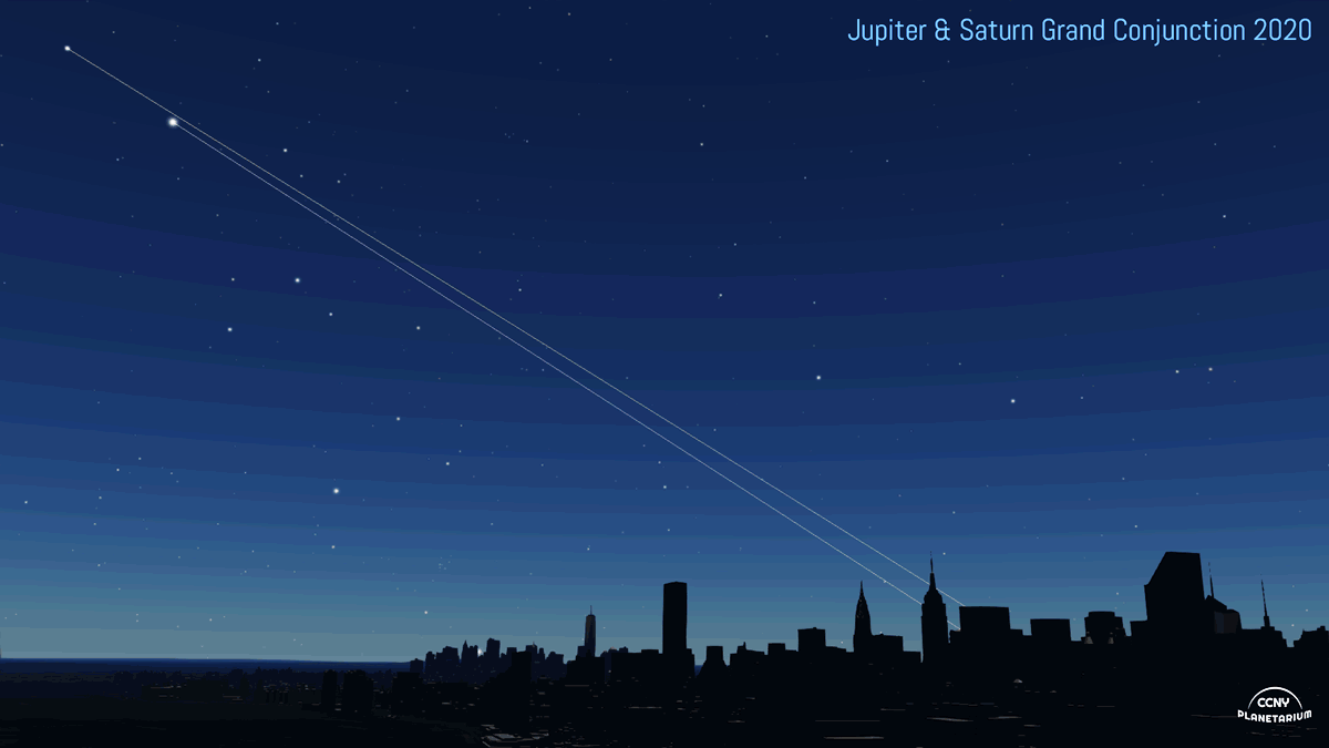
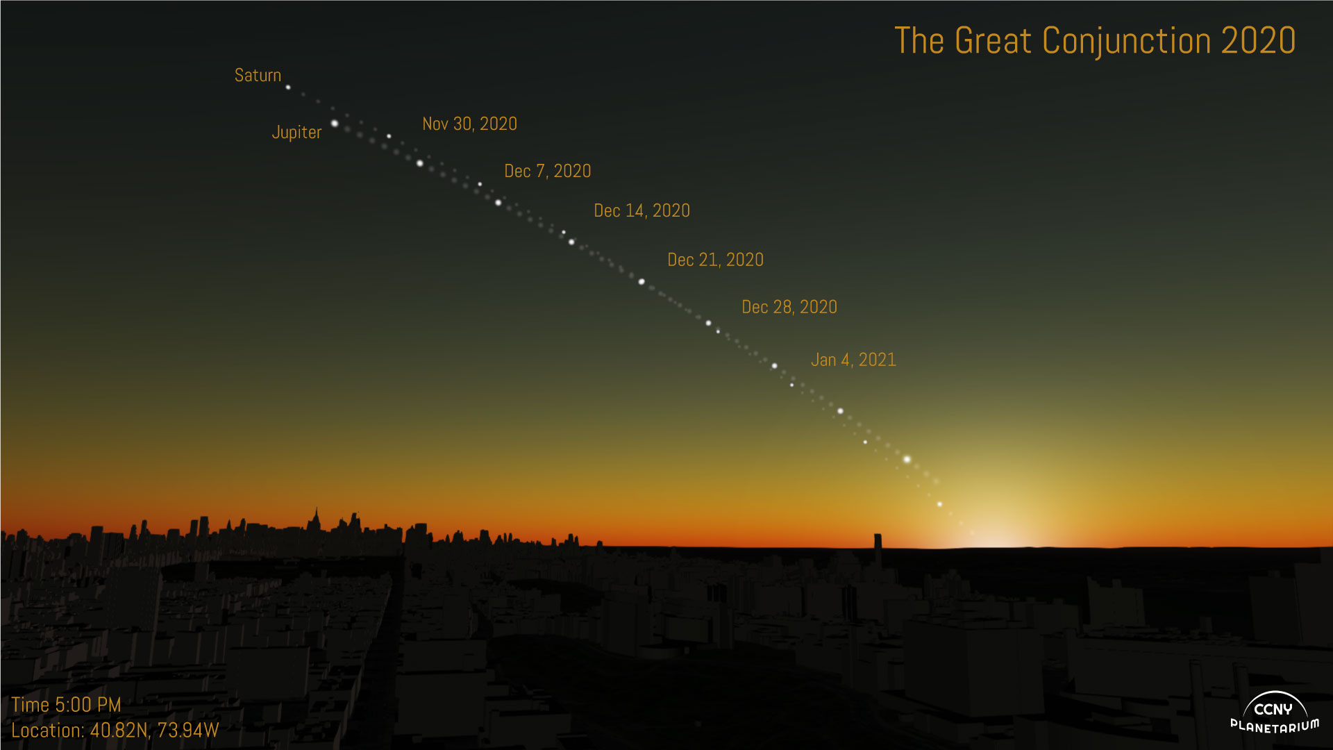
We can superimpose a few weeks worth of snapshots into one still image too:
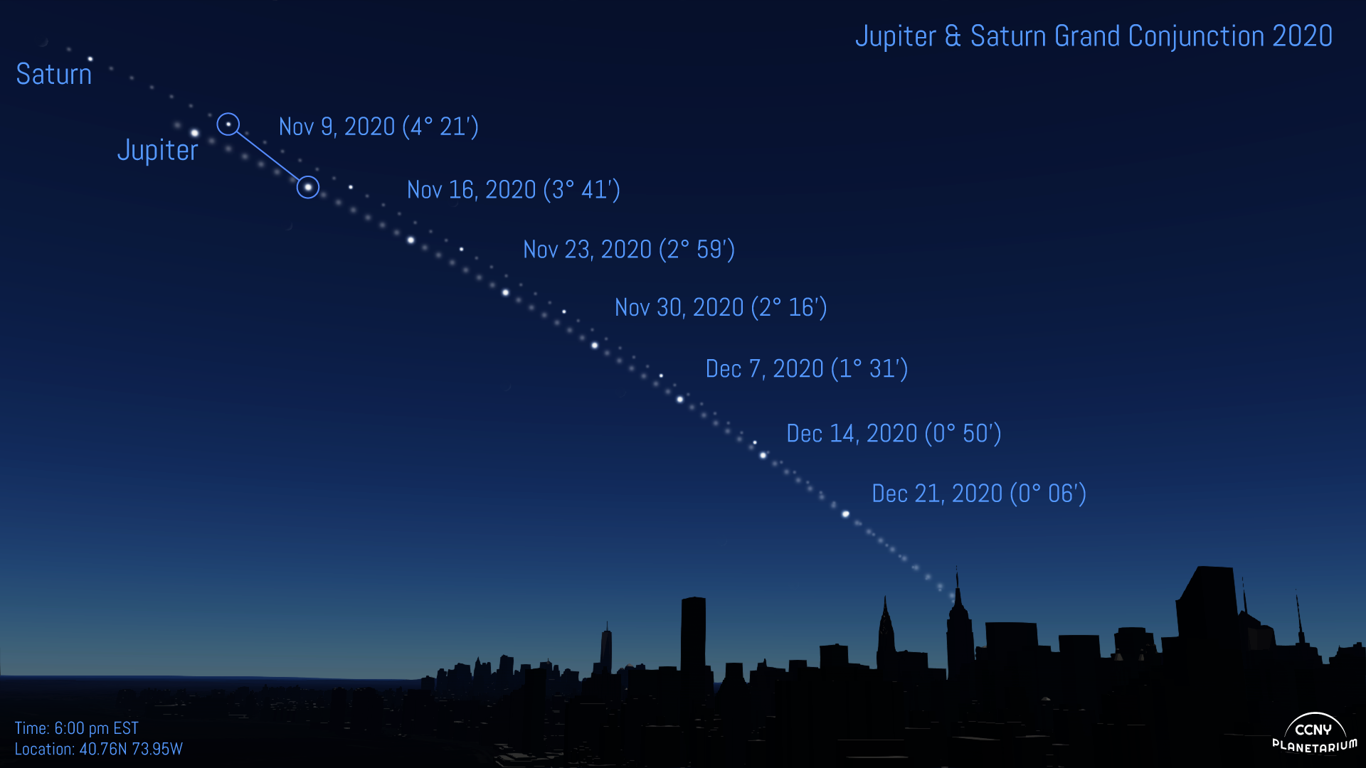
We can immediately see that this looks different than the V shaped image. There is no V. Doesn’t matter where on earth you go, you won’t see a big happy V shape over the course of the weeks before and after the event.
This image is meant to convey what a viewer on Earth would see were they to go out and look at the sky every night for several weeks. And that, I think, is the crux of the issue I’m having with the above mentioned bad viz. It’s so easy with modern software to simulate the night sky that whatever manipulations where done in order to make the V shape (and I’m still not sure what those even were) are just inexcusable.
It's all just made up. This is not at all what the sky looks like.
And then there were more.
After the Flying V started making the rounds, there were of course copy-cats. They took the general shape of the image and just went wild. Mostly local news stations shared these images. Here’s one:
I finally lost my cool yesterday evening when The Atlantic shared this monster:
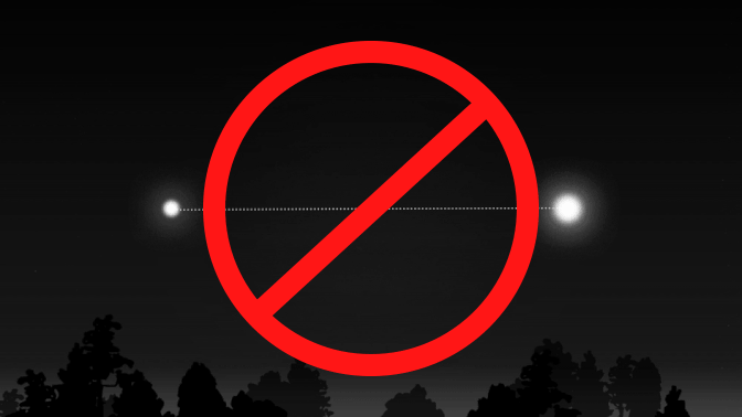
It’s just wrong wrong wrong. And not too interesting. At least the Flying V had some aesthetic merit, even though it was devoid of real astronomy. And, yes, I get it. It can be fun to make pretty pictures that aren’t true to nature. I do it all the time. However, when such works are passed off as physically sound data/sci-viz, then I get angry. We have to do better. Or else, will they trust us when it really matters?
So why is this bad? I mean, it did get people excited about the event right? For sure. And I’m happy that Ft. Greene park had 10-20 curious souls who came to check it out last night. But, I don’t think that excuses complete fabrication of data we have easy access too. It’s not something we need approximate because we don’t know. I saw teachers assigning projects that involved simulating the event. Imagine how those students felt when they tried to corroborate their results and saw the Flying V? Did they go back and massage their data until it looked like that? Many people tried to interpret the V to mean auspicious things: The Year of the Vaccine? is saw in places. It might be, but not because of Jupiter of Saturn.
So, I’ve deliberately left off credits for the above abominations, either because I don’t know who committed the crimes against truth, or simply to prevent and pitchforks (totally happy to put attribution on them if the artists request). I’ve written this out sort of as a diary for the last few weeks since I’ve been doing little else other than making simulated views of the Great Conjunction 2020 and this might help cleanse the palate.
Checks and Balances
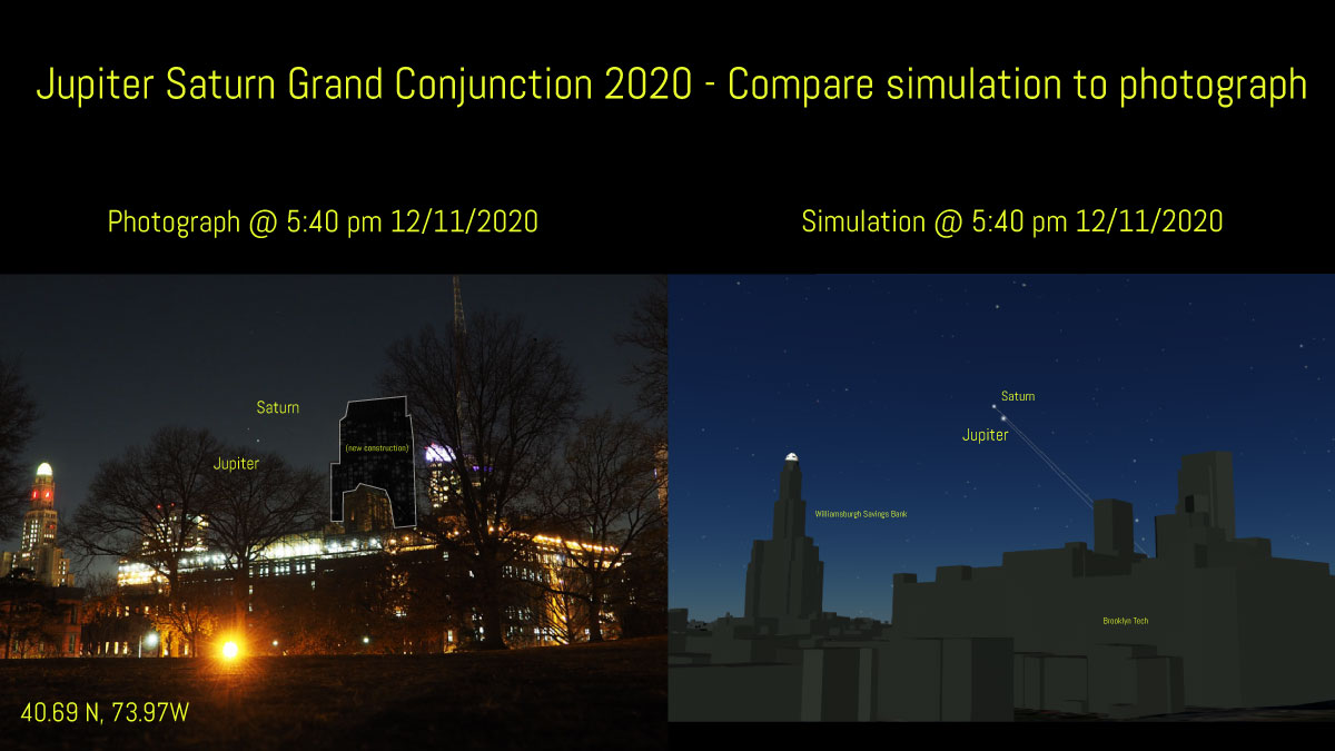
I should also mention, I did of course do the checks on my simulations, and compared them the what I could see, from the park. I’d say they were pretty accurate, within reason:
Parting shot
In thinking about the Flying V, I wondered what made it so compelling. Even in technical groups I’m part of, posts of that image received more likes than the true versions. (go figure!) The Canadian Space Agency shared it. (Wait, they haven’t been to the moon yet, so I guess it’s excusable) Maybe it was the sunset? I added a fake sunset to this one, and yes, it does look cool. But, at least in NYC, the planets where only visible after the orange hues of sunset were gone… another inaccuracy. (And, they’re flipped left-right as someone else pointed out!)
You can see more simulations of the event, from places around the world, on the Planetarium Page: The Jupiter Saturn Great Conjunction of 2020. I’m glad to move on, but will certainly try to get ahead of the next one (in 2080 I think)
Share on: